Never Better: A Bold Display Font for Modern Web Design
As a UI designer who ships landing pages, SaaS dashboards, and conversion-optimized e-commerce experiences, I pay close attention to how typefaces shape perception before the first word is read. Never Better stands out—not just visually, but functionally—as a display font that delivers clarity, confidence, and contemporary energy without sacrificing digital legibility.
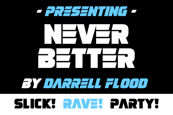
At its core, Never Better is a geometric, high-contrast display typeface with clean terminals, subtle tech-inspired angles, and generous x-heights. It’s not futuristic in a sci-fi cliché sense—it’s future-*ready*: sharp enough for AI startup headers, warm enough for wellness coaching banners, and bold enough to anchor a product launch video overlay. Its personality balances authority with approachability—ideal when your brand needs to signal innovation while remaining human-centered.
Where Never Better Earns Its Place on Screen
This isn’t a body text font—and it shouldn’t be. Never Better thrives where visual hierarchy matters most: hero section headlines, app onboarding screens, course title cards, and branded email headers. On a SaaS pricing page, it transforms “Start Free Trial” from functional to magnetic—especially when set at 48px+ on desktop and scaled thoughtfully down to 32px on mobile viewports.
In online stores, I use Never Better for category banners (“New Arrivals”, “Lab-Tested Skincare”) and limited-time offer bars. Its strong letterforms hold up against textured backgrounds, gradient overlays, and even subtle motion effects—without blurring or rendering inconsistently across Chrome, Safari, or Firefox. For portfolio sites, it adds editorial weight to project titles without competing with imagery. And yes—it works surprisingly well as logo text for digital-native brands (think: a climate analytics dashboard or a no-code tool), especially when exported as SVG with optimized hinting.
Readability & Responsiveness: Practical Considerations
Display fonts can falter on small screens—but Never Better avoids common pitfalls. Its open counters and consistent stroke contrast maintain character recognition down to 24px on mobile. That said, I avoid using it below 20px—even for buttons—because its design intent is impact, not microcopy. For CTAs, I pair it with a highly legible sans serif (like Inter or Manrope) in the button label itself, reserving Never Better for the headline above the CTA row.
On dark mode interfaces, Never Better performs cleanly at medium weights (500–600). Lighter weights risk disappearing; heavier ones can feel overly dense. With image overlays, I always apply a subtle text shadow (text-shadow: 0 2px 4px rgba(0,0,0,0.3)) or a semi-transparent background bar—never rely solely on contrast alone. And crucially: test line height. At large sizes, 1.1–1.15 works best. At smaller display sizes (e.g., section subheads), bump to 1.25 to preserve breathing room.
Font Pairing for Digital Clarity
A great display font earns its keep by elevating—not overwhelming—the rest of the typographic system. With Never Better, I default to pairing it with neutral, highly readable sans serifs for body copy and interface labels: Inter, IBM Plex Sans, or even system stacks like -apple-system, BlinkMacSystemFont. The contrast between its confident geometry and their quiet functionality creates rhythm without tension.
For editorial or premium brand sites (think: a boutique design studio blog or a research-driven newsletter), I’ll occasionally pair Never Better with a restrained serif—like Crimson Pro or Lora—at 18–21px for long-form content. The key is restraint: one display font, one supporting text family, and clear visual separation between roles (size, weight, color, spacing).
Licensing, Formats & Real-World Use
Never Better ships as a web-optimized font family—including WOFF2 files, variable font support (where available), and basic Latin multilingual coverage (accents for French, Spanish, German, etc.). No extended Cyrillic or Arabic glyphs—but for most English-first digital products, that’s sufficient. It includes stylistic alternates (like a single-story ‘a’ or sharper ‘t’) that add nuance to logo lockups or hero graphics—just ensure those alternates render consistently across browsers before deploying.
Crucially: verify licensing scope before embedding. Most premium display font licenses cover web use, but check whether your plan includes commercial templates, client websites, Shopify themes, or SaaS platforms with white-label branding. Some require extended licenses for digital products sold to third parties—so if you’re bundling Never Better into a Figma UI kit or WordPress theme, confirm permissions upfront.
When to Reach for Never Better—And When Not To
Reach for Never Better when you need:
- A hero headline that communicates forward momentum (e.g., “Your Data, Finally Understood”)
- Section dividers in a course sales page that feel intentional, not decorative
- Branded social media banners where typography must stand alone at thumbnail size
- App onboarding steps that benefit from visual confidence—not cuteness or whimsy
- Logo text for tech-adjacent services where trust + clarity > tradition
Avoid it for:
- Body copy, form labels, or navigation menus—its personality overwhelms utility there
- Long paragraphs on low-DPI screens (older Android devices may render fine details less crisply)
- Situations requiring strict accessibility compliance for Level AAA contrast—test rigorously with tools like axe or WAVE
- Brands rooted in heritage, craftsmanship, or analog warmth (here, a serif or hand-drawn script font may align more authentically)
In practice, Never Better doesn’t replace your typographic system—it sharpens it. It’s the kind of premium font that makes visitors pause, not because it’s loud, but because it signals intention. In a landscape saturated with safe, generic type, choosing Never Better says your brand values distinction, clarity, and digital-first craft—without saying a word.