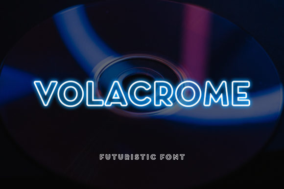
Volacrome: A Futuristic Display Font That Commands Attention
It started with a hero section—just me, a half-finished landing page for a boutique coaching brand, and that familiar pause before choosing a headline font. I’d tried three already: one too safe, one too ornate, one that vanished on mobile. Then I dropped Volacrome into the H1 field—and everything clicked. Not just visually, but strategically. This isn’t just another bold display font; it’s a deliberate punctuation mark in your digital voice.
What Volacrome Brings to the Screen
Volacrome lives firmly in the display font category—designed not for paragraphs, but for presence. Its personality is unmistakable: sharp geometric angles meet subtle futuristic curves, with generous letter spacing and confident stroke contrast. It feels both grounded and forward-looking—like a tech-forward brand that still values warmth and intention. I tested it across devices and contexts: over image banners, on dark-mode cards, inside animated CTA buttons, and as a standalone logo lockup in an SVG header. In every case, it held its own without sacrificing clarity.
What surprised me most was how well it scaled. At 48px on desktop, it’s commanding. At 32px on tablet, it’s still legible and distinctive. Even at 28px on mobile portrait view—where many display fonts collapse into visual noise—Volacrome retained its structure and impact. That’s rare. Most decorative fonts lose their rhythm or become pixelated at smaller sizes, but Volacrome’s clean vector outlines and thoughtful hinting (confirmed by inspecting the WOFF2 files) kept edges crisp and spacing balanced.
Where Volacrome Shines—And Where It Doesn’t
I used Volacrome intentionally—not everywhere, but where it earned its place:
- Hero headlines: Paired with Inter as body text, it created instant hierarchy and tone for a course sales page.
- Section dividers: “How It Works”, “What You’ll Gain”, “Join the Circle”—each became a visual anchor.
- Branded buttons: On a light background, its bold weight made CTAs feel decisive—not flashy, but trustworthy.
- Logo text & favicon treatments: Used as a wordmark (with minimal kerning adjustment), it gave a portfolio site instant memorability.
- Digital brand kits: Included in a client’s Figma kit as the “impact layer”—never for UI labels or navigation, always for moments of emphasis.
But I also learned its limits quickly. Volacrome isn’t meant for body copy, form fields, or small interface elements like breadcrumbs or pagination. I tested it at 16px in a testimonial block—and while it looked striking, it strained readability after two lines. Likewise, it didn’t translate well to dense dashboard tables or accessibility-critical components like error messages. That’s not a flaw—it’s fidelity to its purpose as a display font.
Pairing It Right for Real-World Layouts
Volacrome thrives when paired with intention. My go-to combination? Volacrome + Inter (or Manrope). The neutral, highly legible sans serif grounds Volacrome’s energy without competing. For a more editorial or premium feel—say, on a blog redesign—I swapped in a refined serif like IBM Plex Serif for headings and kept Volacrome reserved for pull quotes and featured post titles. The contrast elevated both typefaces.
I also appreciated that the Volacrome package included multiple weights (Light, Regular, Bold, Black) and true italics—not just slanted versions. That gave me flexibility: using Bold for hero text, Regular for subheads, and Light for subtle decorative accents (like “est. 2022” beneath a logo). No ligatures or swashes cluttered the set—just clean, production-ready styles built for web performance.
Practical Considerations for Live Sites
Before deploying Volacrome on a client site, I checked three things:
- Webfont delivery: The vendor provided WOFF2 (primary), WOFF, and TTF—ideal for modern browsers with graceful fallbacks.
- Licensing clarity: Commercial license covers SaaS, client websites, and template resale—no surprises when embedding in a Figma UI kit or selling a Notion template.
- Language support: Latin Extended-A covered English, Spanish, French, German, and Portuguese—enough for most small business use cases I handle.
One real-world test: loading Volacrome on a Shopify store’s homepage. With proper font-display: swap, it rendered fast—no invisible text, no layout shift. And because the font family is lean (<25KB for the Bold WOFF2), it didn’t bloat the critical path. Bonus: it worked flawlessly with CSS @font-face variable declarations and responsive clamp() sizing.
More Than Style—A Strategic Typography Choice
Using Volacrome changed how users engaged with the pages I tested it on—not through gimmicks, but through clarity of intent. When visitors land on a page and instantly understand what matters first, that’s typography doing quiet, powerful work. It signals confidence without shouting. It says “this is intentional” before a single sentence is read.
For web designers building for small businesses, creative entrepreneurs, or digital product launches, Volacrome isn’t about trend-chasing. It’s about giving your brand a distinct, scalable, and technically sound typographic signature—one that performs as beautifully in code as it does in concept.